The Challenge
Manual Insurance Shopping Bottleneck
Blue Cross Blue Shield of North Carolina's customers struggled to compare insurance plans and complete applications online through BCBSNC.com. The majority of potential customers were forced to call sales representatives to purchase insurance, creating bottlenecks and increasing operational costs.
- Complex Plan Comparison: Customers couldn't effectively compare plan options and understand coverage differences
- Insurance Terminology: Complex insurance terms created confusion and required support calls
- No Decision Support: Lack of clear guidance for different customer scenarios
- Cost Estimation: Inadequate tools for understanding total out-of-pocket costs
Legacy Shopping Process
Plan Search
Customer attempts to find suitable plans
~15 minSupport Call
Customer calls for help understanding options
~45 minPhone Enrollment
Sales rep completes application over phone
~30 min"It's a lot. Are some of these the same plan? It looks like it's a little too much information on this page. That's where someone could easily make a mistake. There's so many to choose from." — Health Insurance Shopper, BCBSNC Customer
Research & Insights
From Research to Design
Support call analysis revealed 65% of shopping time spent on plan comparison—customers couldn't understand deductible vs. premium tradeoffs. This insight directly informed our split-screen plan card design with side-by-side cost comparisons and the "Help Me Choose" wizard for scenario-based recommendations.
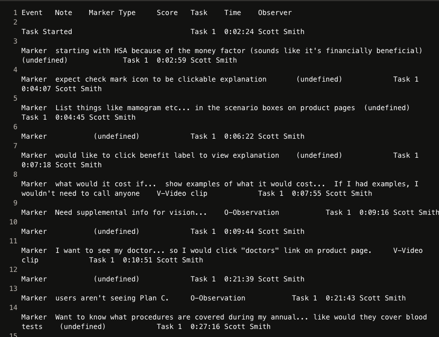
- Support Call Analysis: Analyzed 500 support calls to identify common questions and points of confusion in the shopping process. 45 min average call time, 3.2 calls per enrollment
- Usability Testing: Conducted 15 usability sessions to identify interface issues and opportunities for improvement. Plan comparison = 65% of shopping time
- Competitive Analysis: Evaluated 8 competitor insurance sites to identify best practices and opportunities for differentiation. Focus on self-service + decision support
Design Process
Information Architecture
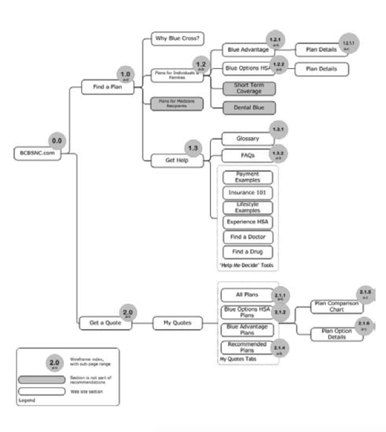
Re‑mapped the entire BCBSNC.com site to consolidate plan information into clear thematic groups and simplified global navigation, setting the foundation for a smoother shopping journey.
- Logical plan grouping & URL hierarchy
- Glossary / self‑service help structure
- Quote‑to‑cart flow audit
Wireframe Sprint
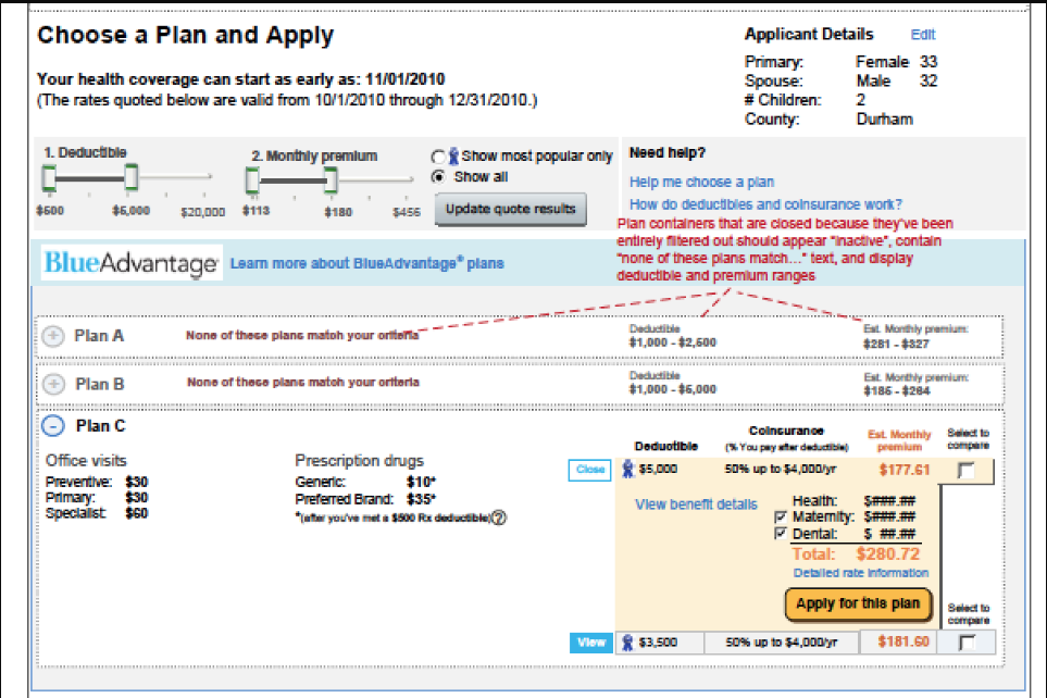
Ran a one‑week design sprint to create mid‑fidelity wireframes for the end‑to‑end plan‑shopping experience, introducing split‑screen plan cards and interactive filters.
- Rapid ideation workshops
- Clickable Figma prototype
- Remote stakeholder reviews
Decision Support Wizard
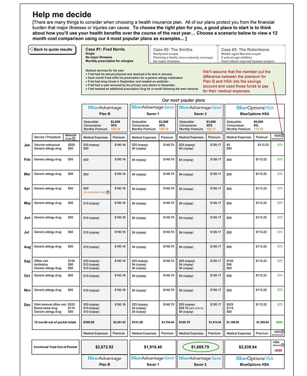
Built the interactive "Help Me Choose" wizard that compared deductibles, out‑of‑pocket max, and premium trade‑offs based on user scenarios. Key interaction design: 5-question flow asking about budget, expected doctor visits, and medications—then showing total estimated annual cost for each plan based on their answers.
- Dynamic cost calculator showing "What you'd pay this year" projections
- Plan recommendation algorithm weighing deductible vs. premium tradeoffs
- A/B copy testing for clarity → "Expected doctor visits" beat "Healthcare usage"
- Scenario comparison: "Healthy year" vs. "Hospital stay" cost breakdowns
Solution
Design Legacy
The design patterns we created in 2010—split-screen plan cards, interactive cost sliders, and scenario-based wizards—are still in use on BCBSNC.com today in 2025. This 15-year longevity demonstrates the timeless UX principles of progressive disclosure, comparison-based decision support, and cost transparency.
Intuitive Plan Shopping Experience
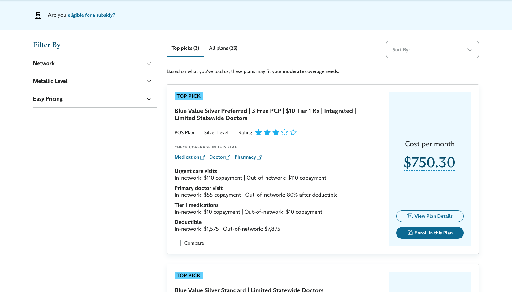
The redesigned BCBSNC.com insurance shopping platform transformed the customer journey by providing clear plan comparisons, interactive cost tools, and streamlined enrollment—enabling customers to make informed decisions without requiring phone support.
Dynamic Plan Filtering
Interactive sliders for deductible and premium ranges with real-time plan updates. Filter by network, coverage level, or total out-of-pocket costs.
Scenario-Based Support
"Help Me Choose" wizard for different customer situations and needs—shows projected annual costs based on expected usage patterns.
Cost Transparency
Clear breakdowns of premiums, deductibles, and out-of-pocket maximums with "What you'll pay" scenarios for common medical events.
Streamlined Enrollment
Simplified application process with smart form validation, progress indicators, and inline help—reduced enrollment time from 45 to 12 minutes.
Impact
175%
Increase in "No-Touch" Sales
Customers completing purchases online
80%
Reduction in Help Desk Calls
Decrease in support requests
2011
Industry Recognition
IMA Outstanding Achievement Award
2.5x
Conversion Rate
Increase in online enrollments
"That was really easy to compare plans and understand costs — I like seeing the real world scenarios and how the costs compare to each other. I don't think I'd have to call anyone to help me with this." — BCBSNC Customer - Prototype Tester